
Good Charts: Smarter Data Visualization.
Good Charts: The HBR Guide to Making Smarter, More Persuasive Data Visualizations by Scott Berinato is a comprehensive guide aimed at helping individuals and organizations create effective and impactful data…
Good Charts: The HBR Guide to Making Smarter, More Persuasive Data Visualizations by Scott Berinato is a comprehensive guide aimed at helping individuals and organizations create effective and impactful data…

A total solar eclipse is a fascinating astronomical phenomenon where the moon passes between the Earth and the sun, completely blocking the sunlight in certain areas. The Washington Post article…
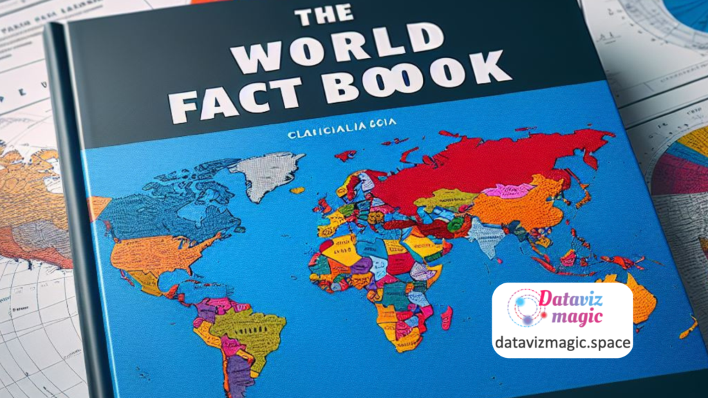
The World Factbook website, maintained by the CIA, is a comprehensive source of information on various aspects of 265 world entities. It provides detailed data on each country's history, population,…
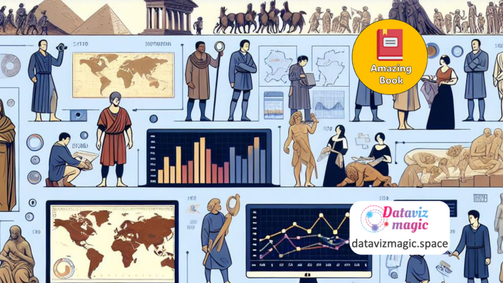
A History of Data Visualization and Graphic Communication by Michael Friendly and Howard Wainer is a comprehensive exploration of the evolution of data visualization and its impact on how we…

The Strategic Data Playbook: A Six-Step Data Strategy Framework to Turn Your Company into a Data-Driven Powerhouse by Wissen Lau is a comprehensive guide designed to help organizations harness the…
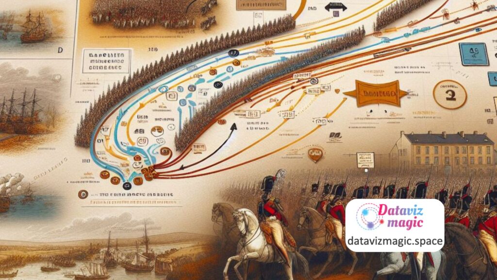
Charles Joseph Minard - Source: SciHi Blog The map of Napoleon's march to Russia, created by Charles Joseph Minard, is often cited as an iconic example of data storytelling and…

Unlocking the Power of Data Storytelling In today's data-driven world, the ability to communicate insights effectively is crucial. Stefano Carnevalli's book, "Data Storytelling: Agile Planning for Insight-Driven Communication," offers a…